
#2MD: bootstrap frontend application
#2MD: bootstrap frontend application
React.js app, choosing React UI library

Introduction
Time to roll up our sleeves and get to the work. I listed stack I will be use in one of my blog: https://blogs.sap.com/2022/09/22/best-sap-cloud-application-stack-🛡.
There is only one thing missing part for me - the React.js UI library. I really want the application to look like the Fiori application, so one of my choices is UI5 Web Components for React. The library is good enough. It delivers quite a big variety of components, beautiful charts and what a like a lot - cards. On the other hand, I am missing a good table component and better ones for a layout like Box, Container, or Grid. It’s also not very popular - even in the SAP ecosystem.
Popular UI React libraries
Below, you could find the most popular and recommended libraries on the Internet:
Material UI - https://mui.com/

Grommet - https://v2.grommet.io/
Chakra - https://chakra-ui.com/

Mantine - https://mantine.dev/
Next UI - https://nextui.org/
I did research on them and in the end, I decided to go with Mantine. It looks clean and simple. It’s free and open source, TypeScript based.
The second place for me was MUI. It implements material design from Google, which could be well received by companies already rooting in this ecosystem. I dedicate a special mention to Next UI - the library looks really cool. It is currently in beta, and the number of components is limited, but in the future, it could be a proper choice for modern applications.
Managing two libraries introduces additional work, but for me, it is an acceptable effort.
Project setup
I will use the create-react-app to set up the application. As I will use Mantine and UI5 Web Components for React, I could initialize the application for one library, and then I have to add the second one.
I started with Mantis as the base library:
npx create-react-app sap-cloud-app-template-react --template typescript
npm install @mantine/core @mantine/hooks @emotion/react
npm run dev
Then I added UI5 Web Components for React.js
npm install @ui5/webcomponents @ui5/webcomponents-react @ui5/webcomponents-fioriFor testing purposes, I added button components and...
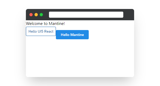
It works :)
Theming
I want to reuse the Horizon Colors from Fiori Design Guidelines, and for that, I used theming functionality from Mantine.
import { ThemingParameters } from '@ui5/webcomponents-react-base';

const fioriHorizonTheme: MantineThemeOverride = {
  colorScheme: 'light',
  white: ThemingParameters.sapBackgroundColor,
};
Using ThemingPrameters I could use exactly the same colors for Mantine parameters. Thanks to it, I could reuse Horizon theming in my custom operators.
Design
I really like the proposition from “SAP Labs Preview”. It inspired me to try implementing something similar.

For now, the code is a bit messy 🧹, but my focus was to check if two UI libraries that could coexist. You can see my work just below:
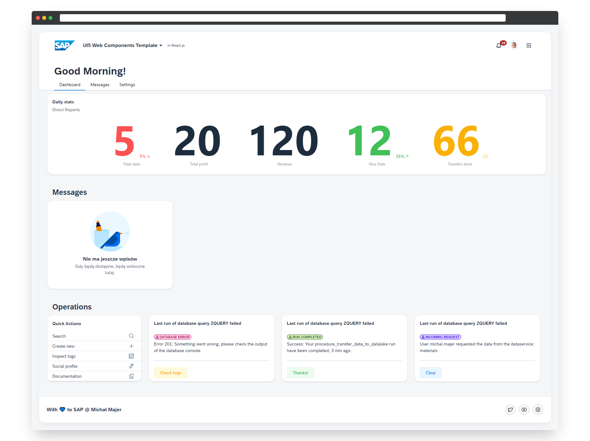
I am really happy with the “final” output 🦄.
There is still much to do:
Prepare the other views + components.
Settings
Notifications
CRUD
Currently, elements are not tightened up. I have to convert it to reusable components.
Navigation.
Deploy the application (at first to Dokku).
Stay tuned for more :)
Please leave a comment, what do you think about my first output? I am looking for any feedback!
If you think that any of the elements should be described in more detail also let me know :)
Useful links:
Theming parameters:
ui5-webcomponents-react/ThemingParameters.ts at main · SAP/ui5-webcomponents-react
I don’t want to hard code the colors when creating a custom theme for the Mantine library. Using those variables, I could pass them to the required object and be consistent.
Horizon Theme Description:
I will need this guideline to use appropriate colors for custom components or Mantine components.
Fiori inspiration:
I liked the SAP Lab preview, which was my inspiration for the main design.
UI5 Icons: